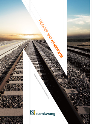
Namkwang Engineering prepares its second leap to become a super blue chip company
We will show the images of Namkwang Engineering, trying to form client-oriented company culture with endless passion and know-how, through various medium including promotion video and brochure.

Namkwang Engineering Broshure(Korea)
대한민국의 건설 역사와 함께한 남광토건의 코퍼레이트 마크는 이니셜 ‘N’을 기본 모티브로 부드러운 선의 사각 형태를 이루고 있다. 이는 건설사로서의 안정성과 자연친화적인 친근한 기업 이미지를 표현하였으며, 기존의 건설사가 가지고 있는 보수적이고 딱딱한 이미지에서 유연성을 가진 기업으로의 무한한 힘과 고객지향의 기업문화를 반영하였다. 또한 이니셜‘N’은 우뚝 솟은 산의 형상을 통하여 초일류기업으로서 제2도약을 표현하였다. Corporate Color 인 Dark Blue는 진취적이고 신뢰할 수 있는 기업의 위상을 담고 있으며 주변색과의 조화로운 칼라배색을 통하여 고객과 교류하고 화합하는 ‘남광토건 B to B 시스템’을 상징화하였으며 빈틈없는 시공사로서의 선진화와 신개념 주거환경을 창조하겠다는 강한 의지를 담고 있다.

Namkwang Engineering Broshure(English)
The Namkwang E&C, a company that grew alongside the history of Korean construction industry, is represented by its corporate mark: a soft-lined rectangular shape forming the company’s initial ‘N’. This mark is designed to illustrate the stable yet environmentally friendly corporate image as well as its flexible characteristic, which is a clear distinction from the inflexible and conservative image of other preexisting construction company. This ultimately shows the company’s infinite possibilities and its client-oriented corporate culture. Also, the initial ‘N’ epitomizes a high-standing mountain expressing the company’s second leap towards its advancement as a top-tier corporation in the industry. The corporate color, Dark Blue, symbolizes the enterprising and trustworthy standing of Namkwang E&C and the color’s harmonious blend into the background collage signifies the ‘Namkwang E&C B to B system’ which is a platform designed for constant communication and cooperation with the clients. Most importantly, the well-arranged colors reflects the strong architect’s will of the company to create an advanced and unique residential environment.
